What’s in a shade? For companies and brands that want to impact consumers and employees, color is an undeniable element in their visual representation that can relay emotion, attitudes and philosophies. Each year, certain shades always rotate in and out of popularity from out of the blue, but behind those viral hues are logical decisions made by color companies to promote new products and ideas through refreshed color schemes.
Towards the end of each year, an official “Color of the Year,” or COTY, is announced by multiple paint and branding companies as the next “It” color in design. It is easy to imagine that the color is decided upon a group of influencers meeting and describing their current favorite colors, but the process behind the choice is highly influenced by current events, global moods, and cultural movements.
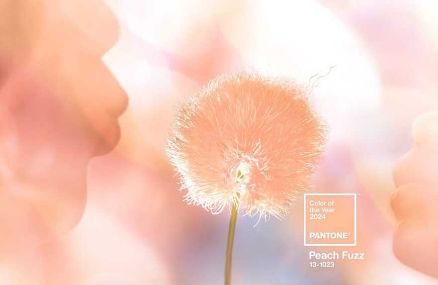
The most well-known COTY is announced every December for the following year by Pantone, which assists more than 10 million designers, companies, and brands in solidifying color consistency in their products. Pantone’s 2024 Color of the Year is Peach Fuzz, a gentle and tender pink-orange hue that is meant to evoke “a new modernity, bringing a feeling of kindness and tenderness, and communicating a message of caring and sharing, community and collaboration”.
How, then, do designers utilize COTYs when considering color scheme options for interior layouts? Do designers blindly follow trends and implement whatever color is the latest fad in hopes that future customers will be drawn to the color scheme?
Not necessarily. Trends, as they say, come and go, and when companies are considering interior design choices, it is wise to take any color trend with a grain of salt. What’s popular today may not translate well into corporate environments or may look outdated in a few years’ time. Longevity is key when investing in new interior upgrades, and interior designers carefully consider how and where bold colors are incorporated so that any changes are not costly for clients down the road.
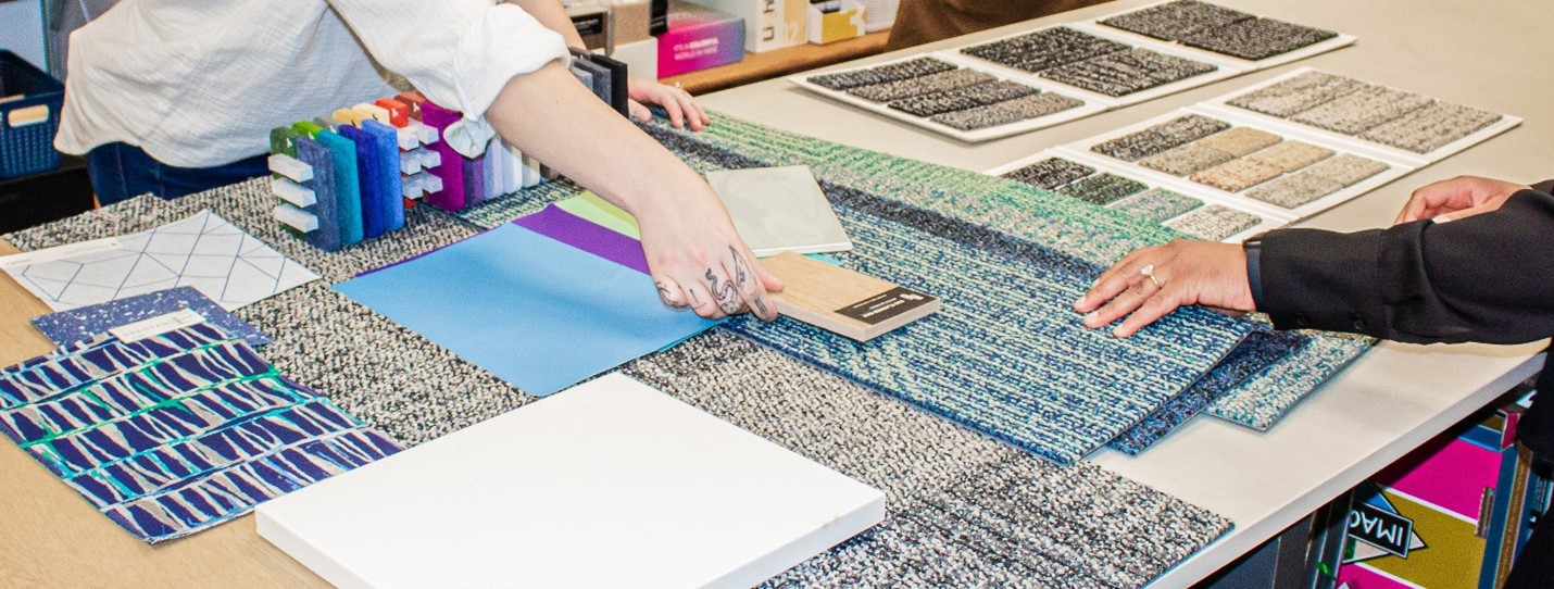
Sample options and color combinations are created during the interior design process to ensure all elements flow together seamlessly.
That’s not to say that companies can’t take inspiration from COTYs and apply color psychology into their workplaces. The colors of our environment have a massive impact on our emotional and mental wellbeing. Hues of red, for example, enhance human metabolism, increase respiration rate, and raise blood pressure. Blues evoke tranquility, healing, serenity and are often used in hospitals, and can increase productivity and create a sense of security. Depending on the needs of individual companies, interior designers can help corporate leaders simulate their ideal brand message within the built environment.
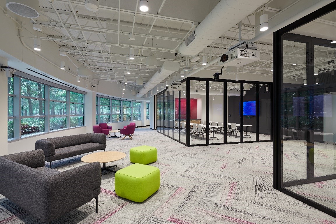
Parexel Durham’s brand colors of vibrant lime green and fuchsia elements infuse energy and creative inspiration into communal work areas.
So, while incorporating the latest Color of the Year into a workplace may look great on Instagram, it pays for companies to consider the full spectrum of color choices and the message they want to convey to employees and clients in years to come. Interior designers can assist clients with choosing a full range of flooring, wall coverings, lighting and accents that provide a wealth of color textures and patterns to satisfy the needs of both employees and customers.
Click here to see examples of how HagerSmith Interior Designers have incorporated brand colorways into their interior design projects.